Badge Information
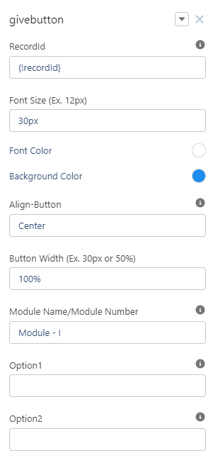
1. Badge Component: Give Button
|
Component Category |
User Information |
|---|---|
|
Component Type |
Custom Component |
|
Component Label |
givebutton |
|
Component Info |
A button to give a badge to other community members on a digital experience site. |
|
Applicable Pages (Suggested) |
User Profile |
The Give Badge Component is a way for community users to give badges manually to other users in the community.
The image below shows how the component looks once it’s been set up.
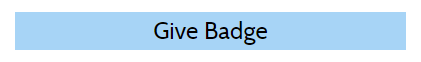
Once the user clicks on Give Badge the below screen will appear.
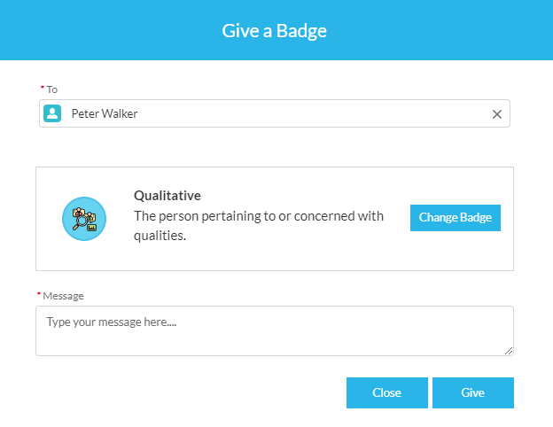
Users can change the Badge by clicking on “Change Badge” Button.
Component Attributes
You can customize the component as per your community branding or theme with help of the table illustrated below.
Table View
|
Option |
Details |
Value |
|---|---|---|
|
Record ID |
[Do Not Change] |
{!recordId} |
|
Font Size |
Enter the font size for the text “GiveButton” etc |
30px |
|
Font Color |
Enter the color for the text “GiveButton” etc |
rgb(255, 255, 255) |
|
Align Button |
Where the button should be aligned on the page - Center/Left/right |
Center |
|
Button Width |
Enter the Width of the “Give Badge” component in either px or % |
100% |
|
Module Name |
Provide the Name of Module |
Module-1 |
|
Option 1 |
Deprecated |
|
|
Option2 |
Deprecated |
|
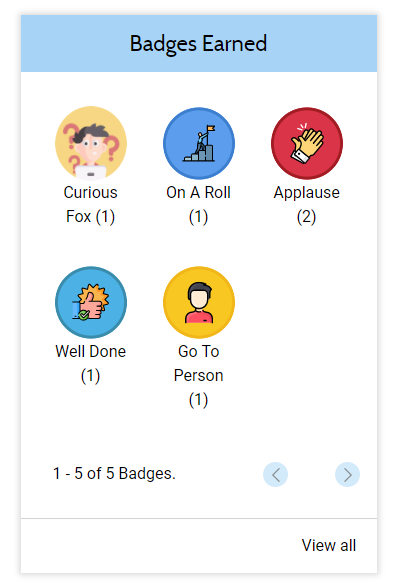
2. Badge Component: Earned Badges at Glance
|
Component Category |
Badge Information |
|---|---|
|
Component Type |
Custom Component |
|
Component Label |
userbadge |
|
Component Info |
To View Earned Badges Information at glance |
|
Applicable Pages (Suggested) |
User Profile |
The Badges Earned Component is a way for community users to view the earned badges in the community, at one place.
The image below shows how the component looks once it’s been set up.
Component Attributes
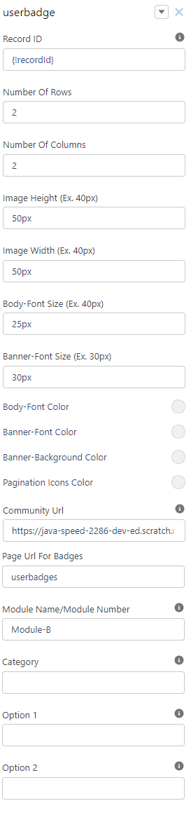
You can customize the detailed view of components with the help of the table illustrated below as per your community branding or theme.
Table View
|
Option |
Details |
Value |
|---|---|---|
|
Record ID |
[Do Not Change] |
{!recordId} |
|
No. of Rows |
Mention the number of rows that should be visible on the component |
2 |
|
No. of Columns |
Mention the number of columns that should be visible on the component |
3 |
|
Image Height |
Mention the height of the image related to that Badge |
50px |
|
Image Width |
Mention the width of the image related to that Badge |
50px |
|
Body-Font Size |
Mention the font Size of the body of the Badge |
25px |
|
Banner Font Size |
Mention the font Size of the Banner for Badges Earned Component |
25px |
|
Body-Font Color |
Mention the font color of the body of the Badge |
RGB(255, 255, 255) |
|
Banner-Font Color |
Mention the Font Color of the Banner for Badges Earned Component |
RGB(255, 255, 255) |
|
Banner-Background Color |
Mention the Background color of the component |
RGB(167, 212, 246) |
|
Pagination Icons Color |
Give the Color to pagination icons |
RGB(167, 212, 246) |
|
Community Url |
Complete URL for your experience site as visible under Digital Experience Site |
https://mycommunity.force.com/Scorenotch/s |
|
Page Url For Badges |
Mention the URL for the page where you can access All Earned Badges Component in detail |
userbadge |
|
Module Name |
Provide the name of Module |
Module-B |
|
Category |
Used to give the Category |
|
|
Option 1 |
Deprecated |
|
|
Option 2 |
Deprecated |
|
3. Badge Component: Earned Badges in Details
|
Component Category |
Badge Information |
|---|---|
|
Component Type |
Custom Component |
|
Component Label |
Userearnedbadge |
|
Component Info |
To View All Badges Information |
|
Applicable Pages (Suggested) |
User Profile (Any custom Page) |
This component is a way for community users to view the earned badges of members in the community, in a detailed list view.
The image below shows how the component looks once it’s been set up.
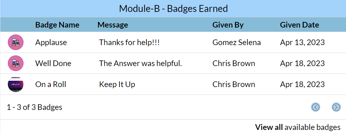
You can customize the detailed view of components with the help of the table illustrated below as per your community branding or theme.
Component Attributes
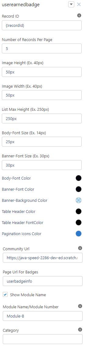
Table View
|
Option |
Details |
Value |
|---|---|---|
|
Record ID |
[Do Not Change] |
{!recordId} |
|
Number of Records Per Page |
Display the Number of Records per page |
5 |
|
Image Height |
Mention the height of the image related to that badge |
50px |
|
Image Width |
Mention the width of the image related to that Badge |
50px |
|
Body-Font Size |
Mention the font size of the body of the Badge |
25px |
|
Banner Font Size |
Mention the font size of the banner for Badges Earned Component |
30px |
|
Body-Font Color |
Mention the font color of the body of the Badge |
RGB(1, 4, 13) |
|
Banner-Font Color |
Mention the font color of the banner for Badges Earned Component |
RGB(0, 2, 12) |
|
Banner-Background Color |
Mention the background color of the component |
RGB(93, 184, 233) |
|
Table Header Color |
Mention the header of color |
RGB(0, 0, 0) |
|
Table Header FontColor |
Mention the font color of the header |
RGB(0, 0, 0) |
|
Pagination Icons Color |
Mention the color of Pagination icons |
RGB(44, 121, 204) |
|
Community Url |
Complete URL for your experience site as visible under Digital Experience Site |
https://mycommunity.force.com/Scorenotch/s |
|
Page Url For Badges |
Mention the URL for the page where you can access All available Badges Components in detail |
UserBadgeinfo |
|
Show Module Name |
Enable the checkbox if you want to show the module name |
True |
|
Module Name |
Mention the Name of the module |
Module - B |
|
Category |
Mention the Category values |
|
4. Badge Component: All Available Badges
|
Component Category |
Badge Information |
|---|---|
|
Component Type |
Custom Component |
|
Component Label |
badgeInfo |
|
Component Info |
To View All Badges Information |
|
Applicable Pages (Suggested) |
User Profile (Any custom Page) |
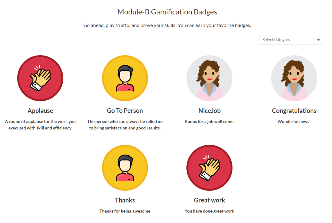
This component details all the badges that can be earned on a specific digital experience site.
Component Attributes
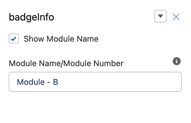
Users can select the Category by clicking on the “Select Button” at top right.